Announcing: Visualization of Hyperparameter Optimization with mlr
This summer I’m working on a project called visualizing hyperparameter tuning and optimization on mlr via Google Summer of Code 2016 with guidance from Lars Kotthoff and Bernd Bischl.
To give you a taste of the project, I’ll start with an extremely trivial example. Let’s say you’re presenting to your boss (or teaching a class or writing a research paper) and you need to explain why you chose a particular number, k, of clusters when you used kmeans to cluster your company’s data. So you might spend 10 minutes or so cleaning the data and throwing it into a decent plot in matplotlib or ggplot where you plot the hyperparameter against some performance measure.
Now imagine you might need to do this 5-10 times a week with slightly different usecases. Why not have this capability built into the package that you’re already using for the rest of your machine learning pipeline?
Of course, this is a relatively trivial example, but we can also explore more complicated processes like nested cross validation and partial dependence plots for simultaneous tuning of multiple hyperparameters.
In the simple example below, we plot the accuracy on the validation set from tuning the SVM hyperparameter C on the Pima Indians dataset. The example uses 50 iteration random search and 3-fold CV:
library(mlr)
ps = makeParamSet(makeNumericParam("C", lower = .01, upper = 5))
ctrl = makeTuneControlRandom(maxit = 50L)
rdesc = makeResampleDesc("CV", iters = 3L)
res = tuneParams("classif.ksvm", task = pid.task, control = ctrl,
           measures = list(acc, mmce), resampling = rdesc, par.set = ps,
           show.info = F)
data = generateHyperParsEffectData(res)
plotHyperParsEffect(data, x = "C", y = "acc.test.mean", plot.type = "line")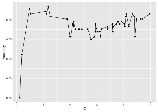
More to come soon!